Opening of jeweller S.M. WILD in Linz: umdasch The Store Makers combines tradition, quality and sophisticated design
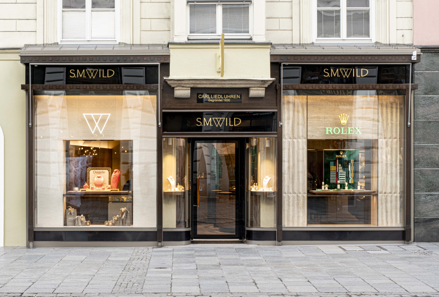
On 3rd November, the new S.M. WILD jeweller's shop opened at Taubenmarkt in Landstraße 16 in Linz. On an area of around 60 m², the traditional jeweller presents itself with a large Rolex display as well as other well-known brands from the watch and jewellery industry. The umdasch Store Makers were responsible for the design, concept and shopfitting of the S.M. WILD multi-brand area as well as for lighting and general contracting throughout the store and implemented a sophisticated, uniform brand image. A project with premium quality.
For more than five decades, the name S.M.WILD has stood for first-class watches and exquisite jewellery creations. The flagship store in the Palais Kaufmännischer Verein in Linz has already received several awards from international expert committees as one of the most beautiful jewellery shops in Europe. The location in Landstraße on Linz's Taubenmarkt, which was taken over by jeweller S.M.WILD in 2022, was also to live up to this claim and therefore underwent a refurbishment. The aim was to develop a design for the S.M.WILD multi-brand area that would fit seamlessly into the existing design of the neighbouring Rolex space to ensure a harmonious and high-quality overall appearance. The result was a uniform look that reflects both the identity of S.M.WILD and that of Rolex.
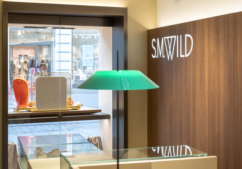
Centrepiece of the S.M.WILD area
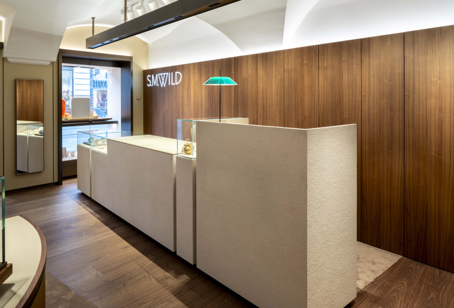
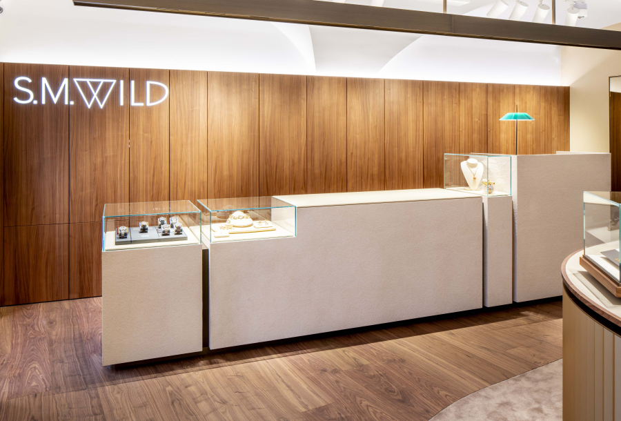
Within the S.M.WILD area, the focus is on various jewellery brands and another watch brand. In the high-end jewellery sector in particular, it is important to actively control the product pressure. This means defining selected areas where goods can be displayed in order to avoid overcrowding. umdasch has solved this in the form of a simple, monolithic counter that also combines numerous functions. It represents the entire customer journey – from inspiration to advice to sales. On the left-hand side, there are display cabinets for presenting watches and jewellery, in the middle a large leather-covered area for advice and fittings and on the right-hand side the checkout area, which also serves as a reception area with its library lamp reminiscent of a hotel reception desk. The counter is clad in thin sandstone veneer – an innovative material that helps to conserve resources by dispensing with solid stone without compromising on elegance. The counter also includes storage space for repair orders and a packing station. Behind it is wall panelling made of fine walnut wood, which contrasts with the light-coloured counter. Above it hangs a bronze lighting element with spotlights that optimally illuminate the jewellery in the display cabinets and the presentation area.
The personal highlight for Phillip Zipfinger from the design team in Amstetten is the choice of materials: "From sandstone veneer to walnut wood and bronze – the outstanding materials used at Juwelier Wild and their high-quality workmanship make the shop itself a jewel that is definitely in the premium segment." Markus Wild, Managing Director at S.M.Wild, is delighted with the successful result: "The ambience of the redesigned shop on Taubenmarkt has reached a level that is otherwise only found at international luxury jewellers. With umdasch The Store Makers, we have found a partner who fulfils our high standards and has implemented them in premium quality."
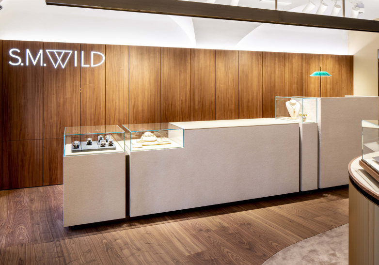
The art of presentation
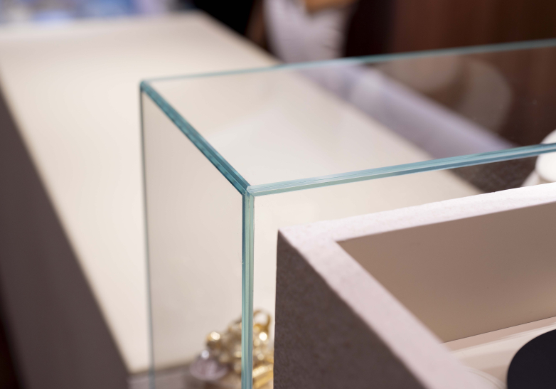
As in any jewellery shop, the lighting and design of the display case glazing played a decisive role at S.M.WILD. The Store Makers installed special lights with laser technology that illuminate the showcases at a narrow beam angle, making the diamonds sparkle particularly impressively. The glazing of the showcases is also positioned in such a way that there are no unwanted reflections and the products are always optimally visible. The use of soft materials in the areas where the products are presented was also important. In the counter area, the umdasch designers therefore provided a carpet that cushions possible falls of jewellery and watches. In addition, a leather-covered shelf was used on the counter to prevent scratches. Of course, safety aspects also played a role – the position of the counter gives employees a good overview of the entrance area.
Challenges and solutions in a historic building
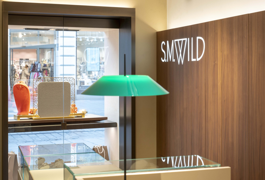
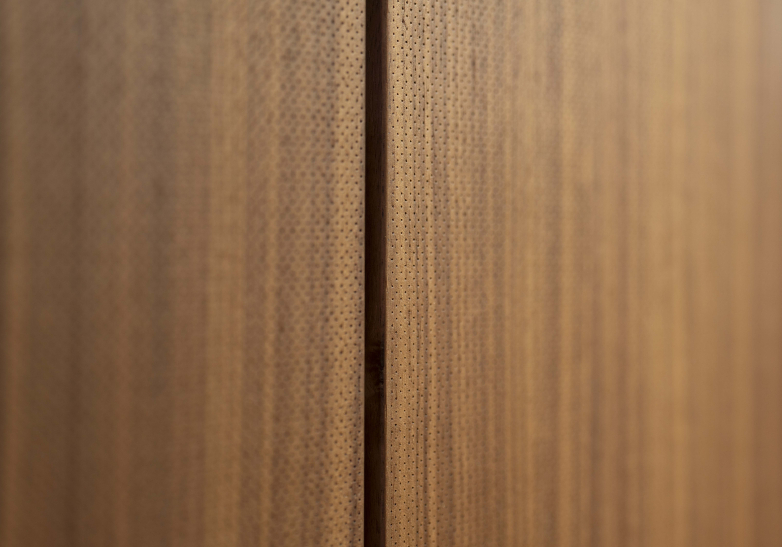
Impressive both inside and out, the historic, listed building also presented the umdasch designers and general contractors with challenges. The imposing vaulted ceiling inside the shop posed a particular acoustic problem, as designer Phillip Zipfinger explains: "We were faced with the task of optimising the room acoustics without compromising the aesthetics. This was a challenge in a room that is so difficult to furnish and in which there are many smooth surfaces. The solution was to use a walnut wall as a generous acoustic wall panelling. It has fine holes and micro-perforations that are almost invisible to the eye but have a significant acoustic effect in the room." The wall panelling makes a significant contribution to improving the room climate and thus to quiet consultations. At the same time, it serves as storage space and provides access to the shop window.
The protection of historical monuments played a major role in the work of the umdasch general contractor team. The complex lighting work in the interior was particularly demanding, taking into account the listed old building. The biggest challenge was the work on the historic exterior façade, in particular the dismantling of the wooden façade elements and the removal and installation of the shop windows to create space for the displays – a task that required adjustments to the portal frame.
Rolex in Landstrasse: A presence with tradition
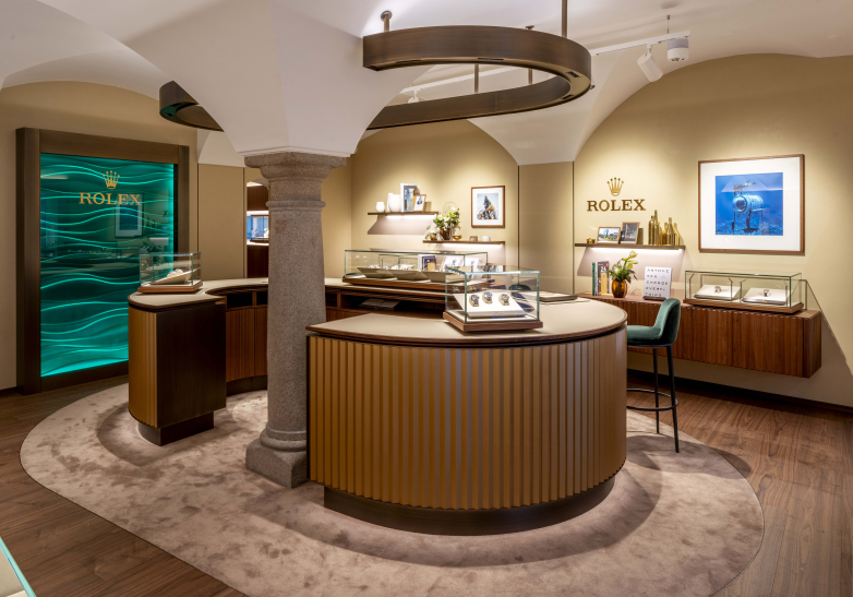
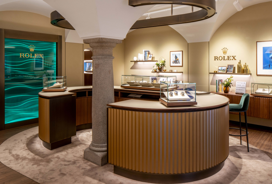
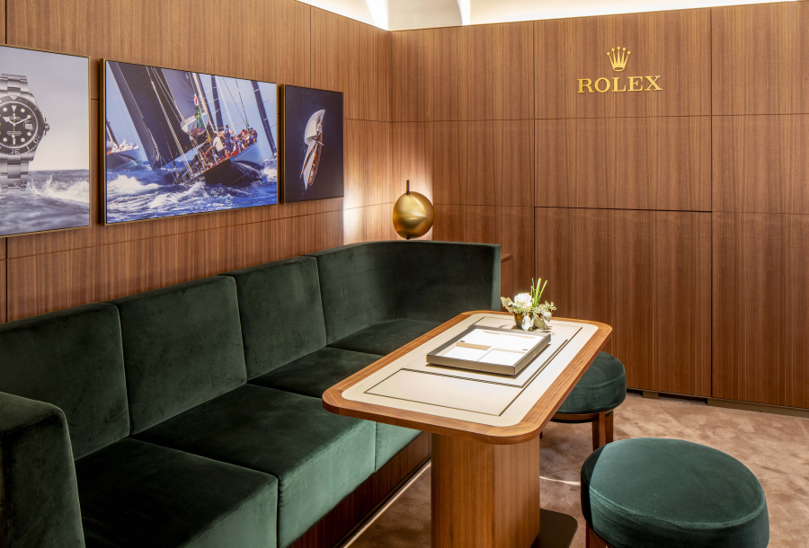
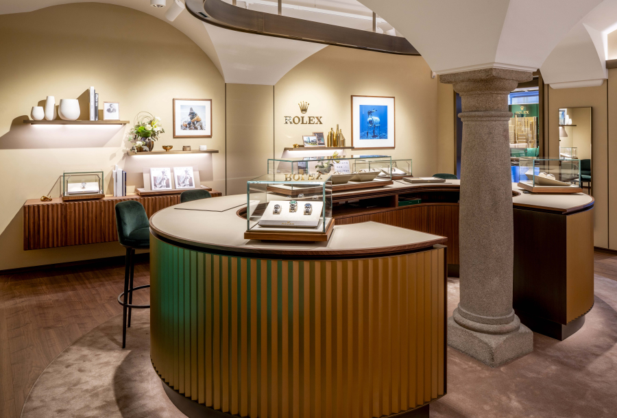
The location in Linzer Landstraße has a long-standing partnership with Rolex, as Rolex founder Hans Wilsdorf personally handed over the licence to the location back in 1954, making it one of the first Rolex sales partners in Austria. The brand with the crown has therefore been represented at this location for almost 70 years. Accordingly, the brand is prominently presented in the store with a design concept developed by Rolex and realised by one of its regular shopfitters. At the centre is a C-shaped counter with storage space and display cabinets, which is built around the historical pillar. Customers can get advice on green stools and a small VIP area with a discreet consultation zone is also part of the Rolex area.
